Blood Bath Productions
In our production logo, we thought a lot about linking it towards our horror name which is Blood Bath. With our opening scene there is a black outline in our background, this allows the audience to feel tense whilst watching the logo and creates an eerie effect for all who is watching;. The eerie effect indicates that something bad could or is about to happen within the sequence. I have used an overlap of increasing music to make the audience feel as though it is leading up to something which switches to a persons leg within a bath and a knife with the tip covered in blood which suggests that they have been sliced or stabbed which then links to our titling sequence. The reason for the editing to be felt as though the camera is being hand held is because this allows the audience to feel as though they are there with us watching what is happening and therefore gives an insight at that current time. We had edited the background colours to a pure white as this allows the blood to stand out more creating a more sinister effect towards our production logo.
In our production logo, we thought a lot about linking it towards our horror name which is Blood Bath. With our opening scene there is a black outline in our background, this allows the audience to feel tense whilst watching the logo and creates an eerie effect for all who is watching;. The eerie effect indicates that something bad could or is about to happen within the sequence. I have used an overlap of increasing music to make the audience feel as though it is leading up to something which switches to a persons leg within a bath and a knife with the tip covered in blood which suggests that they have been sliced or stabbed which then links to our titling sequence. The reason for the editing to be felt as though the camera is being hand held is because this allows the audience to feel as though they are there with us watching what is happening and therefore gives an insight at that current time. We had edited the background colours to a pure white as this allows the blood to stand out more creating a more sinister effect towards our production logo.
|
|
|
|
|
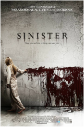
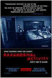
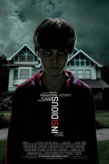
Blumhouse Productions:
The Blumhouse productions logo clip is very effective because it links to the genre of a horror. They have done this by using typical codes and conventions which we expect to see in a horror film. For example, the camera movement used is hand held which we usually expect to see in a horror film, this makes the audience feel unsettled before the film has started. Also the objects floating around the room achieves a sense of paranormality which we are used to experiencing in horror films. The young girl in the logo is wearing an old Victorian dress, again, trying to make the audience feel uneasy and aware that this production company aims to make horror films. This young girl is a stereotypical horror character which is included in order to represent the genre. The music and sound effects used in this logo increase the dramatic atmosphere already created by the shaky camera movements and the buoyant objects. The sound is intensified by the door slamming at the very start of the clip which then adds to the mood. When creating our production company logo we will aim to use a varies and conventions from the horror genre in order to grasp the audiences attention and show them that our company specializes in creating horror films. Also the sound/music in our logo will aim to create a tense and disturbed atmosphere like the sound in the Blumhouse Productions logo.
The Blumhouse productions logo clip is very effective because it links to the genre of a horror. They have done this by using typical codes and conventions which we expect to see in a horror film. For example, the camera movement used is hand held which we usually expect to see in a horror film, this makes the audience feel unsettled before the film has started. Also the objects floating around the room achieves a sense of paranormality which we are used to experiencing in horror films. The young girl in the logo is wearing an old Victorian dress, again, trying to make the audience feel uneasy and aware that this production company aims to make horror films. This young girl is a stereotypical horror character which is included in order to represent the genre. The music and sound effects used in this logo increase the dramatic atmosphere already created by the shaky camera movements and the buoyant objects. The sound is intensified by the door slamming at the very start of the clip which then adds to the mood. When creating our production company logo we will aim to use a varies and conventions from the horror genre in order to grasp the audiences attention and show them that our company specializes in creating horror films. Also the sound/music in our logo will aim to create a tense and disturbed atmosphere like the sound in the Blumhouse Productions logo.
|
|
|
|
|
Hammer Productions:
The Hammer Productions logo is a very basic yet effective logo which links in with what the company are trying to achieve. Hammer Productions is a popular production company which was founded in 1934 and is well known for their horror films throughout the 1900's. In their logo they have included a simple font in front of a black background which draws attention to their name. Inside the font they have included lots of moving and changing images which shows characters from many of their old films. These pictures include scared victims, mummies and strange monsters which have clearly been used in some of their films. Most of these images relate well to the horror genre but do not aim to make our audience feel wary or frightened before the film starts. However, it does allow the audience to recognize that this is a very experienced company who have made some popular horror films in the past. We can also see that this company aim to make universal horror films because at the end of the clip the writing goes crimson red; the color red holds many contrasting connotations but the main one is simply that it represents evil, blood and danger which links with the horror genre. When creating our production logo we will make sure that it looks professional and effective in representing the genre like Hammer Productions.
The Hammer Productions logo is a very basic yet effective logo which links in with what the company are trying to achieve. Hammer Productions is a popular production company which was founded in 1934 and is well known for their horror films throughout the 1900's. In their logo they have included a simple font in front of a black background which draws attention to their name. Inside the font they have included lots of moving and changing images which shows characters from many of their old films. These pictures include scared victims, mummies and strange monsters which have clearly been used in some of their films. Most of these images relate well to the horror genre but do not aim to make our audience feel wary or frightened before the film starts. However, it does allow the audience to recognize that this is a very experienced company who have made some popular horror films in the past. We can also see that this company aim to make universal horror films because at the end of the clip the writing goes crimson red; the color red holds many contrasting connotations but the main one is simply that it represents evil, blood and danger which links with the horror genre. When creating our production logo we will make sure that it looks professional and effective in representing the genre like Hammer Productions.
|
|
|
Twisted Pictures:
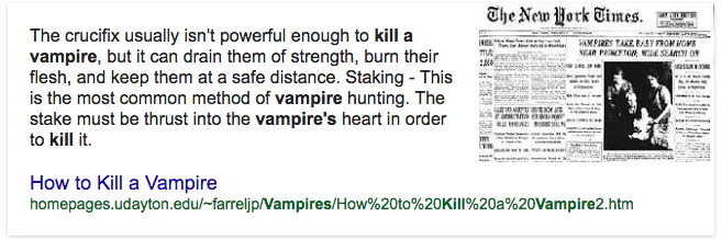
The Twisted Pictures logo is effective due to its link to the earliest horrors. The words "twisted pictures" quickly fade in with barb wire whilst quickly twisting and maneuvering around the words with the ends of the wire curling around each other between the words. Then a stake quickly drops down and rotates clockwise, twisting the ends of the wire around with it and tightening the barbed wire around the words. The stake helps the production company link back to the earliest horrors due to being able to kill a vampire by puncturing it with a stake.
Twisted pictures is an American independent production company, the company was founded in 2004 by Evolution Entertainment's Mark Burg, Oren Koules and Gregg Hoffman. They are best known from all of the Saw films. Twisted Pictures was formed after the box office success of Saw in 2004, which led to a nine-picture distribution deal with Lionsgate.The company went on to produce six sequels in the Saw film series. Twisted Pictures is able to relate to earlier years of horror genre and this allows the audience to reconnect with the logo showing them that the film they are about to watch is going to be good due to the representation of the logo and company. Within the logo the barbed wire and stake creates the gorgy effect - this allowed us to relate this to blood and slicing therefore we took the idea of blood and merged it into our production company logo 'Blood Bath Productions' which already has a gory effect within the name as it mentions blood which therefore indicates there is going to be a blood scene somewhere within our production.
|
|
|
Rogue Pictures:
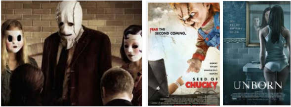
Rogue pictures was an American production company found in 1997 and was based in Universal City, California. The logo has a dramatic and sinister effect as each letter is introduced as a single with a metal slice sound which eventually joins together to complete the logo. The shadow which is used on the lettering creates the 'ghost' effect as it is represented onto the screen. The simplicity of the logo allows questioning and leaves people feeling tensed as if they are waiting for something to pop up whilst watching all the lettering come together. Rogue Pictures have come together to create other horror genres such as; The Strangers, Seed of Chuck, Unborn and so on. Within the strangers it is a home invasion horror film which involves a young couple who is terrorized by three masked assailants, Seed of Chucky involves a doll who is resurrected by their son who then hit Hollywood with a murder spree on the way. Finally, Unborn involves a supernatural horror film where a woman is tormented by a devil and seeks help from a rabbi, the devil wants to seek her death as a portal to physical existence. This production company allowed me to collect inspiration for different skills to use within my horror, within a horror genre it is not all blood and gore. It can also involved supernatural skills, terrorisms and beyond the existence - a living doll.
Rogue pictures was an American production company found in 1997 and was based in Universal City, California. The logo has a dramatic and sinister effect as each letter is introduced as a single with a metal slice sound which eventually joins together to complete the logo. The shadow which is used on the lettering creates the 'ghost' effect as it is represented onto the screen. The simplicity of the logo allows questioning and leaves people feeling tensed as if they are waiting for something to pop up whilst watching all the lettering come together. Rogue Pictures have come together to create other horror genres such as; The Strangers, Seed of Chuck, Unborn and so on. Within the strangers it is a home invasion horror film which involves a young couple who is terrorized by three masked assailants, Seed of Chucky involves a doll who is resurrected by their son who then hit Hollywood with a murder spree on the way. Finally, Unborn involves a supernatural horror film where a woman is tormented by a devil and seeks help from a rabbi, the devil wants to seek her death as a portal to physical existence. This production company allowed me to collect inspiration for different skills to use within my horror, within a horror genre it is not all blood and gore. It can also involved supernatural skills, terrorisms and beyond the existence - a living doll.
